
One of my favorite things about fountain pens is the variety of inks available. From water-resistant archival blacks for my drawings to muted, minimalist colors for everyday writing, there's always something new to try. The different colors and unique properties are part of what makes collecting fountain pen inks so fun!
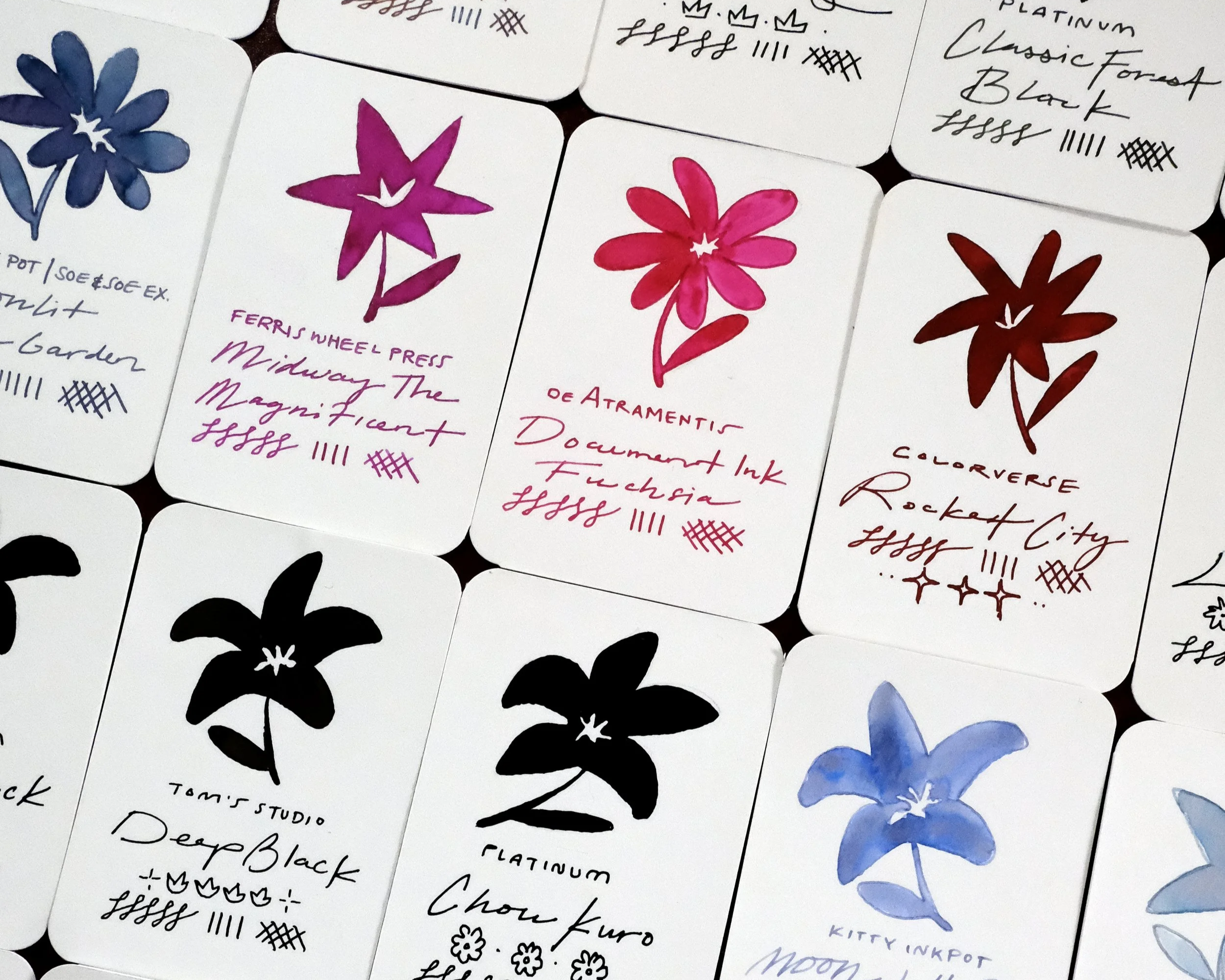
I started keeping an ink swatch journal as a way to document the fountain pen inks in my collection and see how they look on MD paper. But I never found a system that was particularly useful beyond looking at the swatches themselves. I found myself buying similar colors, repeating inks, and losing track of what I already had. Until now!
I finally created a swatching system that I can continue to grow as my collection changes, and I thought it might be useful to share with you, too.
Why I Swatch Fountain Pen Inks
Looking at an ink online or through the bottle doesn't always tell the whole story. The way an ink appears on paper can vary depending on the paper, nib, and amount of ink being put down.
I've found myself disappointed by inks I've picked up because they turned out to be too dry or too light for my liking. I also have a soft spot for muted colors, which has gotten me into trouble more than a few times when an ink looked completely different on paper than I expected!
I wanted a swatching system that would give me a better idea of what to expect before filling a pen. It's also a fun way to compare colors, notice subtle differences, and appreciate the little details that make each ink interesting.
How I Swatch My Inks
For consistency, I use the same setup for each entry in my Fountain Pen Ink Journal:
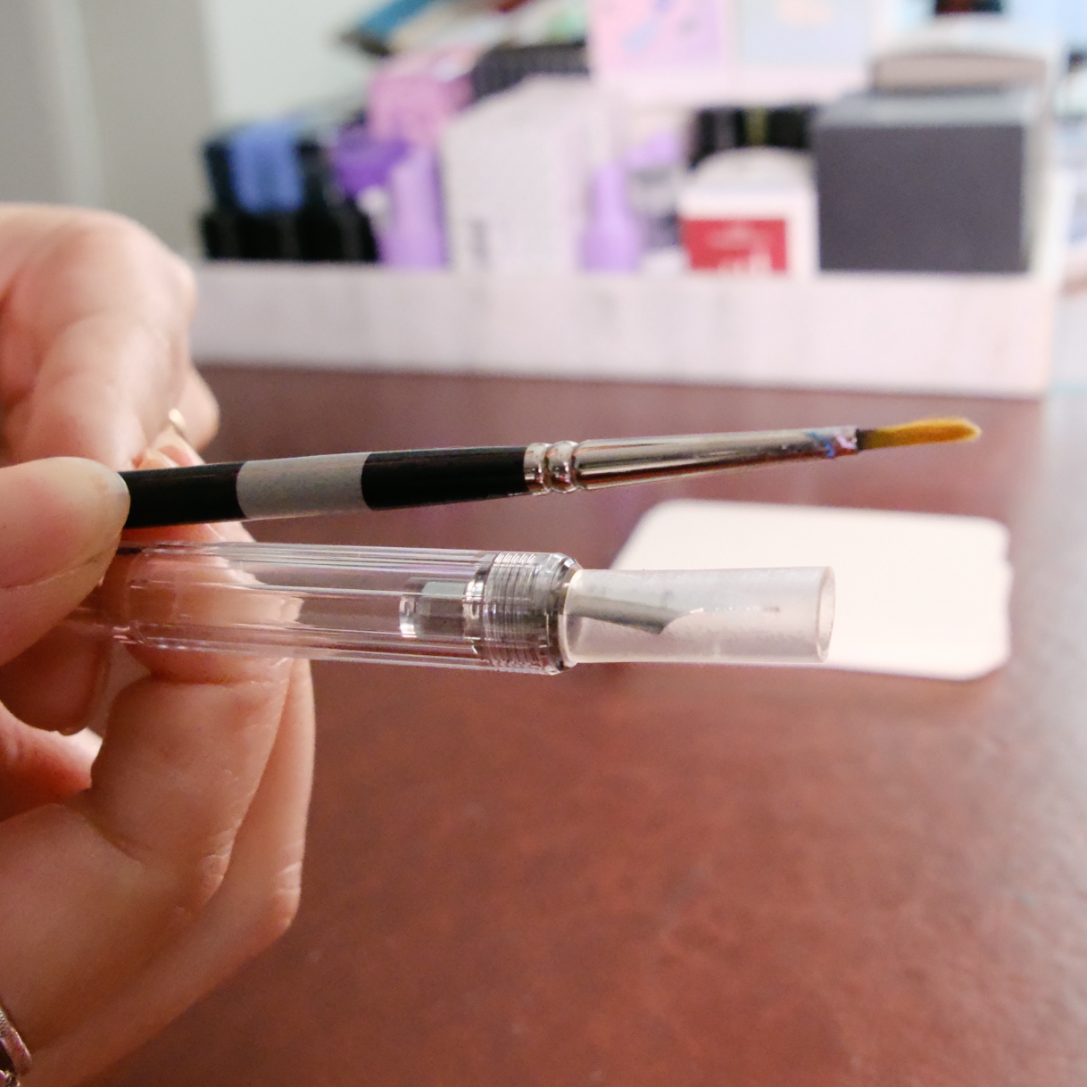
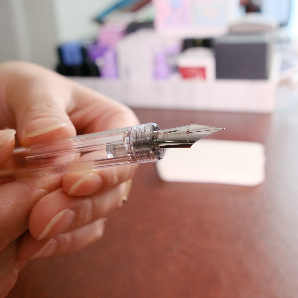
Pen: Pilot Iro-Utsushi dip pen with a fine (F) nib
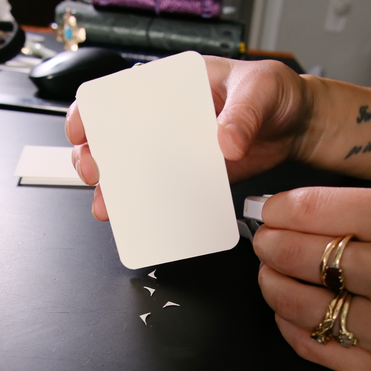
Paper: Midori MD Cream paper, backed with heavy cardstock
Using the same pen and paper gives me a consistent way to compare inks across my collection. I especially like using a fine nib because it's closer to how I typically write with my fountain pens. Broader nibs can put down more ink and show certain characteristics differently, so I wanted my samples to reflect a finer writing experience.
Midori MD Cream paper is also a favorite of mine and the paper I use in all of my journals. I wanted my ink swatches to reflect how the colors actually look on the paper I write on every day. Many ink swatches you'll find online are photographed on white paper, so using MD Cream adds a slightly warmer tone that can change how certain colors appear.
Purchase Pilot Iro-Utsushi dip pen (Amazon)→
Affiliate Disclosure: This post contains affiliate links. As an Amazon Associate I earn from qualifying purchases. I may earn a commission if you purchase through my links, at no additional cost to you.
What I Look for in an Ink
Color is usually the first thing that catches my attention, but there's more to an ink than its base shade. Some inks have beautiful shading, where the color changes depending on how much ink reaches the paper. Kitty Inkpot, I'm looking at you! Others have sheen, which creates a different color or metallic-looking effect in certain areas. Diamine has some great examples of this!
I also pay attention to saturation, how an ink flows across the page, and whether the color looks different from what I expected.
Not every ink needs to have an elaborate finish to be interesting. Sometimes a simple, everyday color is exactly what I'm looking for.


Browse the Ink Journal
The Ink Journal is an ongoing collection, and I'll continue adding new swatches as I try more inks. You'll find a mix of brands, colors, and finishes, all sampled using the same fine nib and paper.
Whether you're looking for a new ink to try, comparing a color you're already considering, or just enjoy seeing different inks on paper, I hope you find something interesting in the collection.

Great for Artist | Ultra-deep black ink that’s water resistant and dries matte finish.